
Assurant Design System created by Cadabra
Design System
My Role
Implementation
Visual Design
Interaction Design
I got to Redesign this piece of shit portal utilizing Assurant’s newly created Design System.
Underwriters needed a better design to the current system to quickly search, and access vehicle claims for vintage automobiles.

Original Design of the Dashboard

Early sketches of the Confirmation Page
The original designs were outdated and overwhelming. By utilizing a few core elements of the Design System, I made it easier for the Underwriters to use.

Header documentation
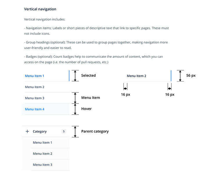
Navigation documentation

Button style and usage
The three areas that had the most impact were the Header, Navigation and Button Styles

Redesign of the Dashboard by Implementing the Design System
Cluttered elements were systematized, multiple button had a visual hierarchy, and clean white space on easy-to-read card styles improved the experience.
By containing the information on a card, users could now scan each hole, and have a better sense of where each player was in the tournament, and how they fared during each round.
Key Takeaways from the redesign:
56% increase in engagement for Home section
Successful in driving users to consume more content, in particular Live Video compared to 2014