
Photo Credit: USAToday
Ryder Cup Mobile App
My Role
Creative Direction
Sketches
Visual Design
User Flows
Interaction Design
The Ryder Cup is a biannual event between the best golfers from Europe and the United States.
In 2016, the Ryder Cup website underwent a complete redesign. Once the desktop and mobile experiences were completed, I began my approach to designing the iOS and Android apps.
From a UX perspective, a lot had changed since the last Ryder Cup tournament in 2014.
The iOS app in particular, felt dated. Its structure couldn’t support the PGA’s goal of increasing live video consumption.

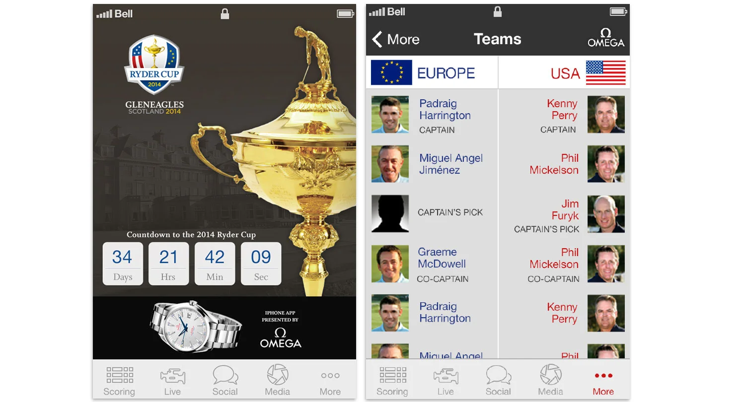
2014 Ryder Cup iOS
The event was also being hosted in the United States, so the amount of traffic to the site and the apps would be significantly higher than our numbers from 2014.

Photo Credit: USAToday

Possible’s Approach to the Desktop and Mobile Experience

Main Screen Sketches
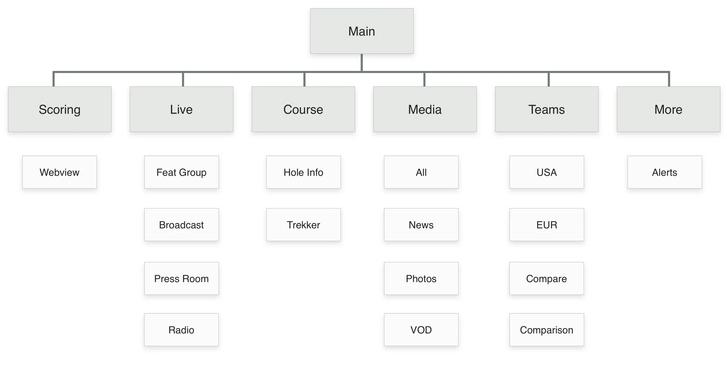
Mobile App Sitemap
Research showed the main screen netted the highest amount of traffic.
I wanted our users to get a quick sense of how the matches were unfolding. I created carousel’s for our most important info, such as Live Video, News and Media, and Minute by Minute.

2016 iOS Main Screen
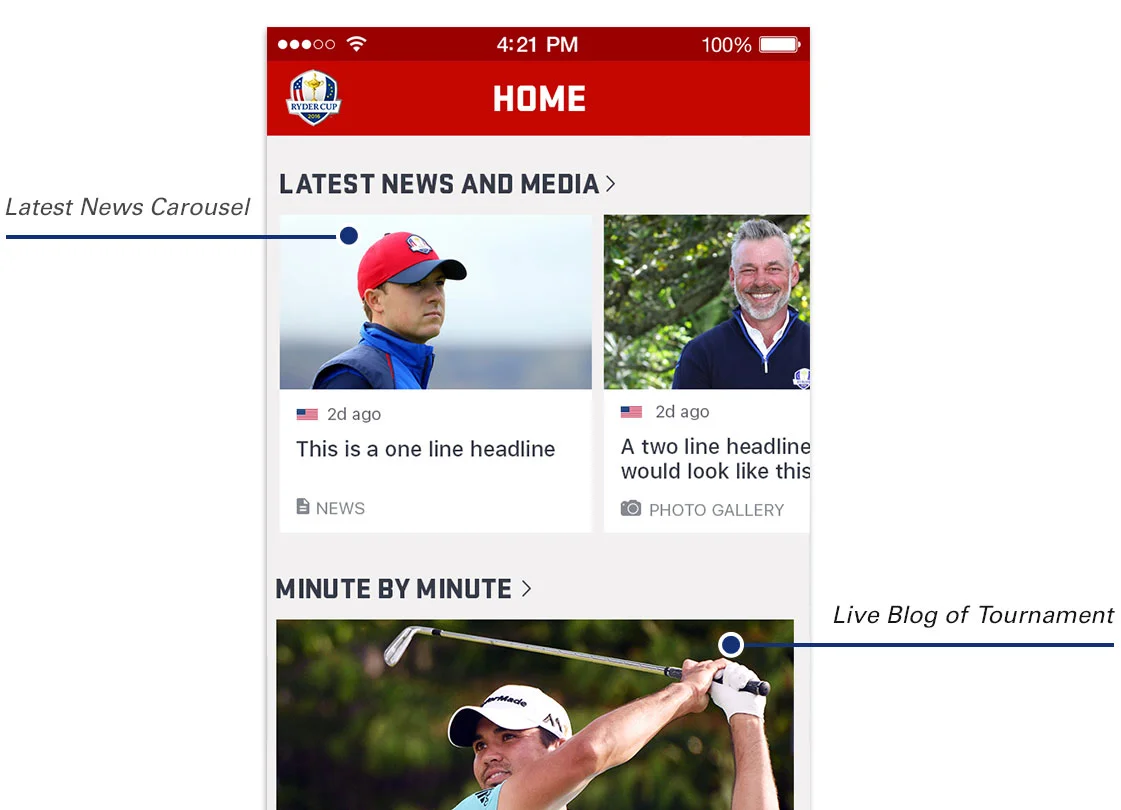
2016 iOS Main Screen
Teams

Team Section Sketches
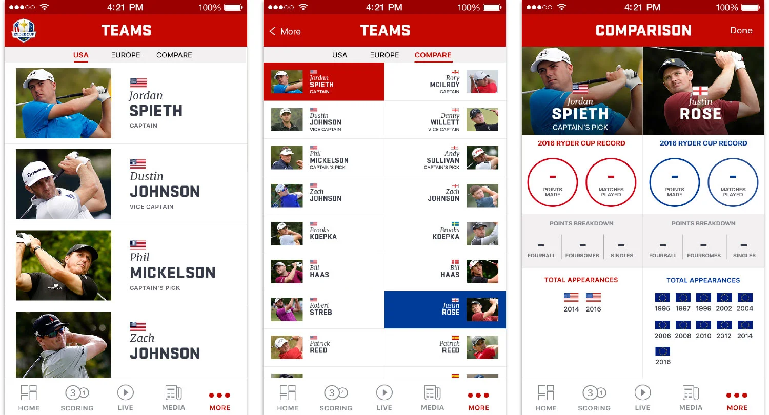
In 2014, the teams were featured in the app, but there wasn’t a way to compare them.
I designed an interactive experience that compared and contrasted potential matchups.
2016 iOS Redesign
Once in the compare section, I designed two separate scrollable columns, with the United States on the left, and the European players on the right.
After selecting one player from each team, a modal would pop up to compare their points, stats, and total Ryder Cup appearances.

Teams User Flow

2016 iOS Teams Redesign

2016 iPad iOS Redesign
Live Video Overlay

Sketches for Live Video Overlay
The Ryder Cup format for scoring is different from a typical stroke-play event. There are only 2 or three matches going one at once.
I wanted our audience to have the ability to check the scores without leaving the video experience.

Scoring Overlay User Flow

2016 Android Live Redesign

2016 Android Live Redesign
I designed the video overlay to pop-out from the top right corner, as to not impede the video experience.
To clear the overlay, users simply tapped the screen.
Sub Navigation

2014 iOS Media Screen
In 2014, the Media section utilized iOS’s original interface, with segmented controls and list view.
Our content had grown, and required a different design solution for 2016

2016 iOS Teams Redesign
I designed a secondary navigation to swipe between categories, and implemented scrollable card designs.
The cards created harmony between the course, and home screens. The sub-nav was also used for the teams screen.