
Scoring Redesign
My Role:
Sketching
Sitemaps
Wireframing
User Flows
Visual Design
Interaction Design
With any large-scale redesign, there are inevitable areas of risk, compromise, and oversights.
After redesigning the PGA Championship experience in 2017, we found ourselves in the latter category.
Scoring Web-view

Our team implemented a web-view of the leaderboard in all of our Android and iOS apps, replacing the native scoring experience we had previously.
A web-view made sense from a cost-effective and technical standpoint; It was more practical to create a single leaderboard that worked on all platforms.

Unfortunately, the web-view created a poor user-experience.
Scoring rows wouldn’t open; Users had to swipe multiple times to move down the leaderboard. And worst of all, on iOS, favorite players would be wiped out anytime the users would leave the app and come back.
iPhones have consistently been our most popular device, so the malfunctioning web-view proved to be a huge oversight.


Desktop Scoring Tray Sitemap

Desktop Scoring Tray Wires

Mobile-Web Scoring Tray Wires
For 2018, there was no question a native scoring experience had to be implemented for both iOS and Android apps. But I also realized my previous design of the opened scoring tray needed to be reworked.
I couldn’t start with the native app experience; I had to go back and update the scoring tray for desktop and mobile, first.
Desktop Experience

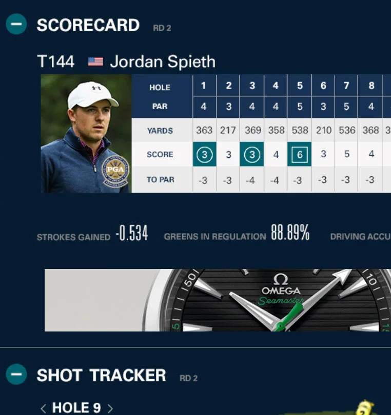
2017 Scoring Tray Design
Within the scoring page, the leaderboard tray opened when a user clicked on the player’s row. Once the tray was fully expanded, there were three sections displayed: the player’s scorecard, shot tracker, and a highlight reel of their best shots from the tournament.
For the redesign, there were several things I knew needed to change:
The dark blue background
The length of the opened tray
The amount of content.
Problem: Background Color
2017 Dark Blue Background
Each section of the tray was enclosed within a dark blue container. I wanted to create a contrast between the white background of the scoring page, and the look of the actual player rows in the leaderboard. Unfortunately, the color was too heavy on the eye, and added further confusion to an already busy area.

2018 Redesigned White Background
Solution:
Change the background to white
Removing the dark blue background immediately created a lighter, and more breathable space for the content. The white space allowed the scorecard, and shot tracker to have prominence, rather than blend in with the rest of content.
Problem: Length of Tray
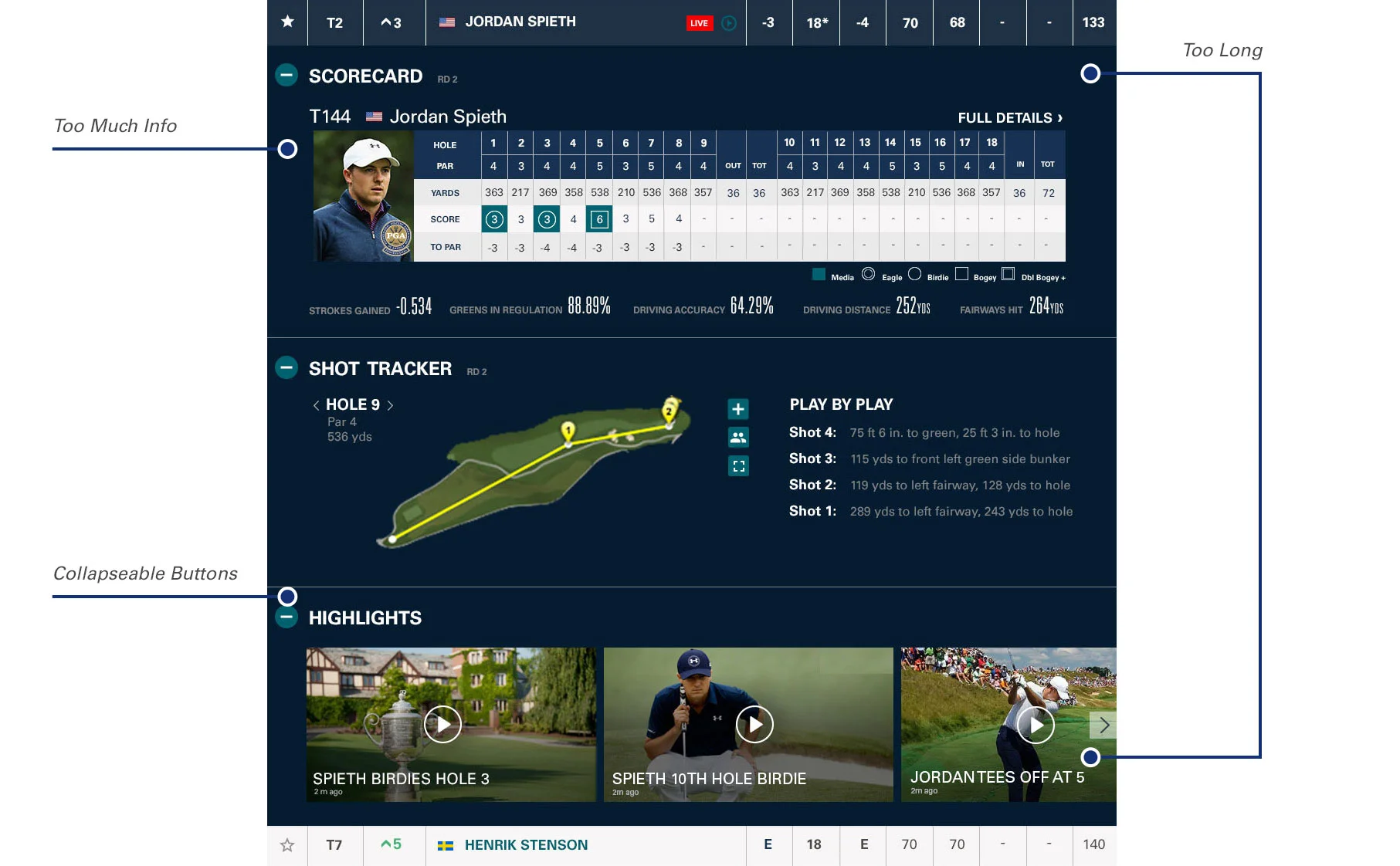
2017 Lengthy Tray Design
The original design had each section of scorecard, shot tracker, and highlights as its own container. Users could expand or collapse each one separately.
When it was developed, all three sections expanded, forcing the user to either collapse each box they didn’t want to see, or scroll further down to get to the next player in the leaderboard.

2018 Redesigned Length of Tray
Solution:
Display fewer pieces of content to shorten the entire tray
It was important to keep the tray from going down the screen too far, and to present all the content in the tray above the fold.
Research showed users were interested in the player’s scorecard, and shot tracker.
To conserve space, I redesigned the scorecard to display only the most engaging features.

2018 Scoring Tray Redesign
By removing the carousel, condensing Shot Tracker and scorecard, and turning text-heavy statistics into infographics, the scoring tray was a better experience for our users.
Mobile
2018 Mobile Scoring Tray
App Solution

2017 iOS Scoring Web-View
With the redesign of desktop and mobile completed, I now turned my attention to the mobile apps.

2018 Sitemap for iOS App

Wireframes for iOS App

2018 Scoring User Flow

2018 Scoring Tray
I updated the way the scoring tray opened. It went from a long, three-tiered section of content, to now displaying Scoring and Shot Tracker.
The design would default to the scorecard, but the user also had the option to swipe to see the Shot Tracker feature.

2018 Redesigned Scoring Tray